
Radar charts, also called web charts, spider charts or star charts, are often used to display various characteristics of a profile simultaneously. Whether it presents a tennis player’s statistics or a client’s preferences, the main outcome of a radar chart is a simple polygon, commonly known as a shape. This shape has specificities: it covers a surface, has sides of various lengths, has many different angles, is often colored, etc. The singularity of this shape is sure to help catch readers’ often limited attention. Before long, they are intrigued, trying to interpret the meaning of this geometric form.
Figure 1A is a radar chart illustrating the spread of graduate students amongst eight sectors of education in Canada. Values are percentages. Those familiar with radar charts may find this one easy to interpret. Experience has taught us that users repeatedly exposed to the same radar chart will eventually come to think of its shape as a unique, data-driven, and accurate representation of the profile under study. Unfortunately, this idealized representation does not correspond to reality. As other authors have previously pointed out, this chart is problematic in many ways. In this short piece, I will briefly review the main reasons why many experts blacklist the radar chart and, with these limitations in mind, I’ll then present four alternatives. While none of them are perfect, I believe they deserve some consideration.
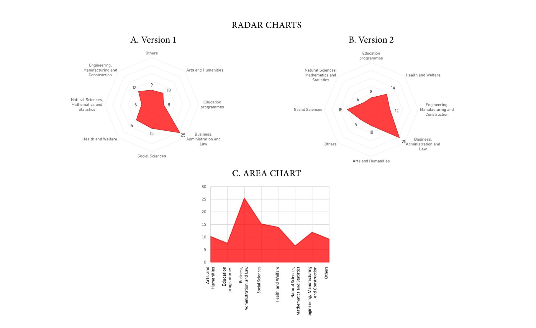
Figure 1: Percentage of total graduate students by sector of education in Canada.
Issues
Data visualization’s primary objective is to present statistical information in a more accessible fashion than classic number listings (i.e. tables). Alas, only a small fraction of what appears on a radar chart serves this very purpose. In Figure 1A, the only piece of information that is fully data-driven is the distance between each angle and the center of the radar. In contrast, the rest results from complex interactions between the underlying data and a subjective, editorial decision: the ordering of categories around the circle. The overall shape, the surface covered, sides, and angles will substantially change as a result of a simple permutation of the categories. As Figure 1B shows, even the number of sides and angles depends on the ordering of categories. What first resembled an eight-sided hat now looks like a triangle.
There is another problem with this shape. A colored surface such as this one is also the main feature of area charts. In fact, to a certain extent, a radar chart is an area chart where the x-axis takes a concentric form instead of that of a flat line. Due to their similarities, some of the design rules that apply to area charts are similarly relevant to radar charts. In our example, sectors of education is a categorial variable with eight values, but the outline connects neighboring percentages as if this was a continuous variable. This problem becomes evident if we arrange the same data as an area chart instead (see Figure 1C). Using lines to connect categories gives the erroneous impression that values progressively increase or decrease from one sector to the next, which is not the case. In short, radar charts contradict one of the most basic data visualization rules: don’t connect categories with lines.
Alternatives
All in all, the few relevant data points stored in a radar chart are largely flooded in a concentrated flow of irrelevant information. Unfortunately, this type of chart brings the latter to the forefront. So, what are the alternatives?
A good one would have to meet two criteria: (1) display correct information while (2) attracting and keeping the reader’s attention. With a continuous dependent variable and a categorical independent variable, a bar chart is undoubtedly the most common option. However, and precisely because it is so common, it risks scoring quite low on our second criterion. An alternative could be to use the bar chart’s funky little sister, the lollipop chart (Figure 2A). Consisting of thinner bars each topped with a bubble, this option leaves no ambiguity about how to interpret the data, and it is (slightly) more original than a bar chart. But let’s admit it: what makes a radar chart so eye-catching is the use of the radial axis, or concentric grid, that makes it look like a spider’s web or compass. Fortunately, it is possible to keep this feature intact while tackling some of the issues with radar charts.
Figure 2B shows a radial column chart. This graph is like a bar chart with a zero value in the middle of the grid. Contrary to the polygon found in radar charts, the radial column chart clearly emphasizes the distance between the bullseye and the data point using a simple bar instead of angles, sides, and an area. The same transformation can be applied to lollipop charts, resulting in Figure 2C, which could be called a radial lollipop chart. Finally, Figure 2D shows a fourth option, which, so far, is also my favorite. This graph is a personal adaptation of Figure 2B, replacing bars with spears, giving the overall chart the look of a wind rose or a star. Much to my dismay, the names “wind rose charts” and “star charts” are already used for other graphs. I will thus refer to this one as the stellar chart. Whether it has three or 11 categories, it will always have the shape of a star. The stellar chart is as accurate and as eye-catching as the radial column chart, but it is also more elegant.
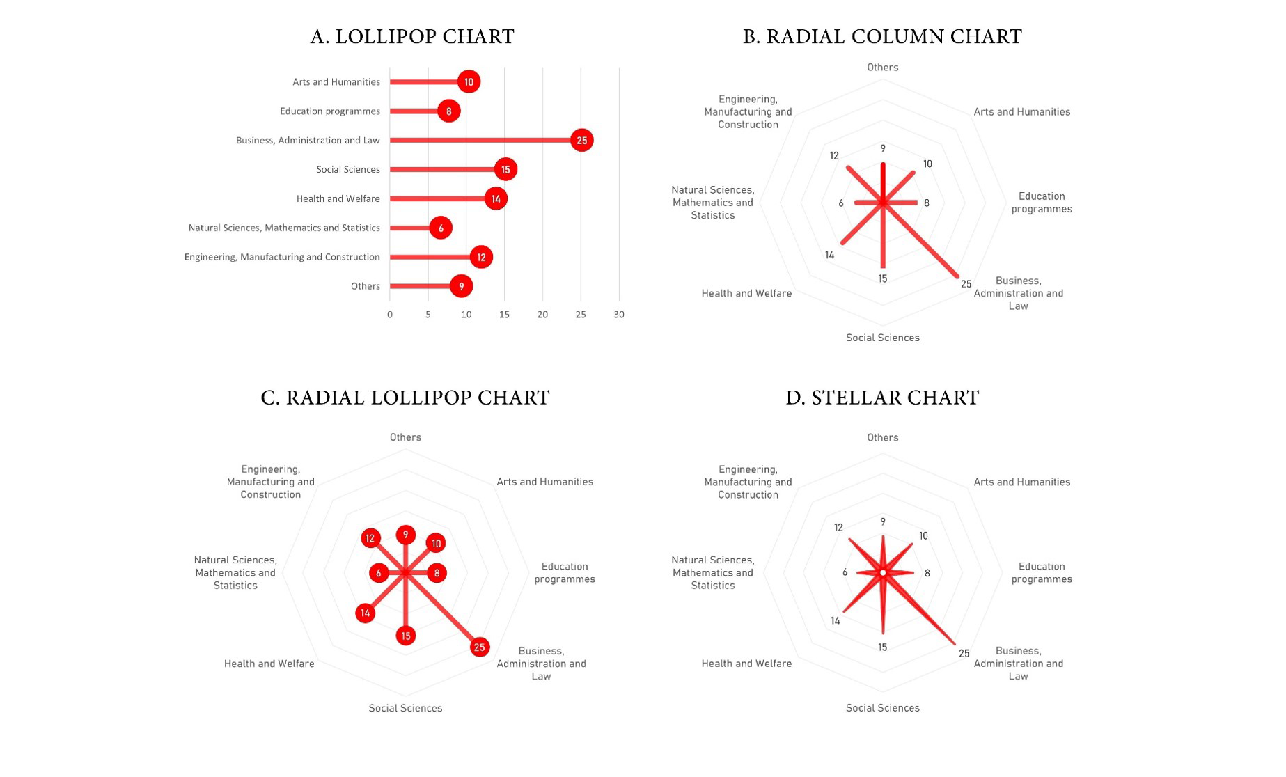
Figure 2: Alternatives to radar charts.
Radar charts can help to compare different profiles. A common practice is to put two or more semi-transparent polygons on top of one another. On some occasions, the outcome highlights clear-cut differences between the profiles. But, most of the time, the result is a crowded chart with unreadable overlapping data points and no space available for value labels. Again, the obvious alternative is to use a bar chart, one showing multiple series of data. But if one prefers radial charts, another option is to use small multiples next to one other, while keeping categories unmoved and the minimum and maximum of the y-axis constant. Figure 3 shows an example, comparing data for Canada with Germany using the stellar chart.
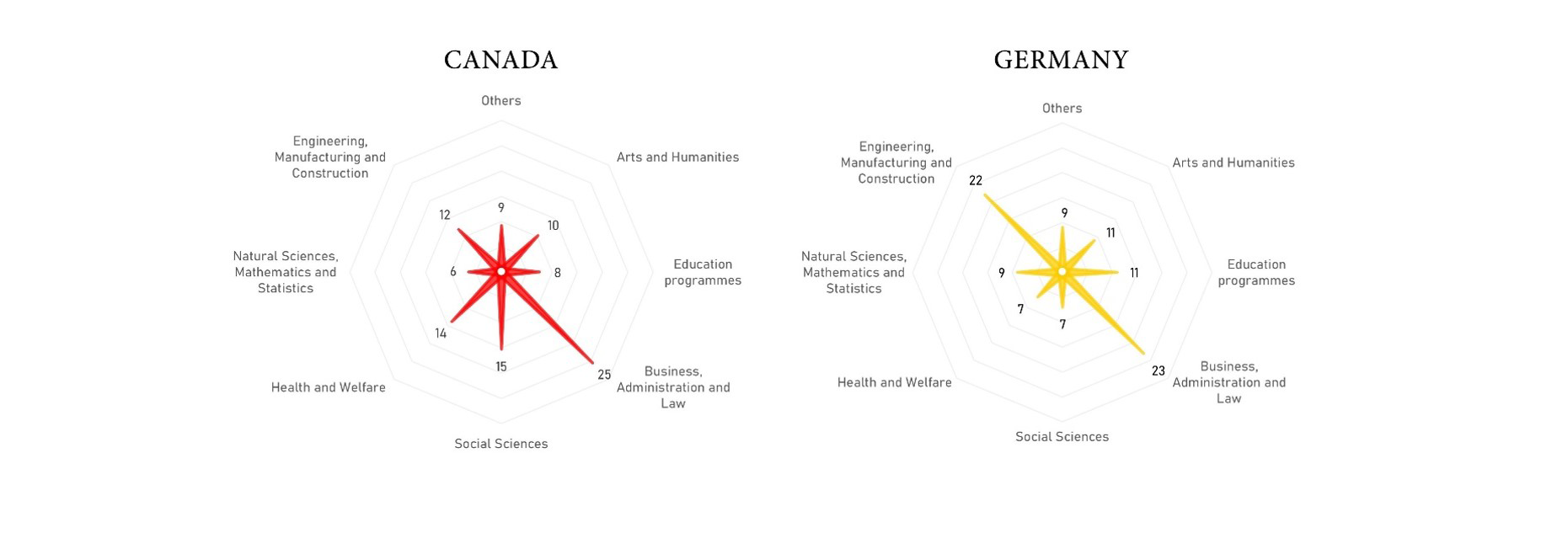
Figure 3: Percentage of total graduate students by sector of education in Canada and Germany.
Pros and cons
Of course, the alternatives presented here also have their limitations. Some of these limitations are also present in radar charts. For instance, while the lollipop chart can display negative values, trying to do the same with a radial chart would be nothing short of perilous. Additionally, Figures 2 B, C, and D will look different if one permutes the order of categories, although the change is much less dramatic than with radar charts.
While fixing some issues, new problems can also emerge. When a radial chart includes an even number of categories, readers may inadvertently focus on the contrasts between pairs of categories placed on opposite sides of the centre point, or “bullseye”. Another issue affects the lollipop radial chart in particular: some readers may look at it and see a network diagram, confusing bubbles for nodes, and bars for the links between them.
Even though these alternatives have their pros and cons, I think they offer more advantages than disadvantages, certainly when compared with radar charts.
Whether radar charts should be banned from the data visualization toolkit is a matter of some debate within the data visualization community. My view is that radial column charts, radial lollipop charts, and stellar charts would make for suitable replacements.
Note
All charts made using Excel and Powerpoint. The data come from The World Bank, year 2016 for Canada, 2017 for Germany. A version of this article first appeared in May 2020 in Nightingale, the journal of the Data Visualization Society.
Acknowledgements
Thanks to Valérie Milner for copyediting my poor English writing.
About the author
Alexandre Morin-Chassé is a social scientist, data analyst, tennis player and Montrealer. Morin-Chassé has a PhD in political science and crunches education and health data for a living.


