
Our first example describes how Simpson’s Paradox accounts for a highly surprising observation in a healthcare study. Our second example involves an apparent violation of the law of supply and demand: we describe a situation in which price changes seem to bear no relationship with quantity purchased. This counterintuitive relationship, however, disappears once we break the data into finer time periods. Our final example illustrates how a naive analysis of marginal profit improvements resulting from a price optimization project can potentially mislead senior business management, leading to incorrect conclusions and inappropriate decisions. Mathematically, Simpson’s Paradox is a fairly simple – if counterintuitive – arithmetic phenomenon. Yet its significance for business analytics is quite far-reaching. Simpson’s Paradox vividly illustrates why business analytics must not be viewed as a purely technical subject appropriate for mechanization or automation. Tacit knowledge, domain expertise, common sense, and above all critical thinking, are necessary if analytics projects are to reliably lead to appropriate evidence-based decision making.
The past several years have seen decision making in many areas of business steadily evolve from judgment-driven domains into scientific domains in which the analysis of data and careful consideration of evidence are more prominent than ever before. Additionally, mainstream books, movies, alternative media and newspapers have covered many topics describing how fact and metric driven analysis and subsequent action can exceed results previously achieved through less rigorous methods. This trend has been driven in part by the explosive growth of data availability resulting from Enterprise Resource Planning (ERP) and Customer Relationship Management (CRM) applications and the Internet and eCommerce more generally. There are estimates that predict that more data will be created in the next four years than in the history of the planet. For example, Wal-Mart handles over one million customer transactions every hour, feeding databases estimated at more than 2.5 petabytes in size – the equivalent of 167 times the books in the United States Library of Congress.
Additionally, computing power has increased exponentially over the past 30 years and this trend is expected to continue. In 1969, astronauts landed on the moon with a 32-kilobyte memory computer. Today, the average personal computer has more computing power than the entire U.S. space program at that time. Decoding the human genome took 10 years when it was first done in 2003; now the same task can be performed in a week or less. Finally, a large consumer credit card issuer crunched two years of data (73 billion transactions) in 13 minutes, which not long ago took over one month.
This explosion of data availability and the advances in computing power and processing tools and software have paved the way for statistical modeling to be at the front and center of decision making not just in business, but everywhere. Statistics is the means to interpret data and transform vast amounts of raw data into meaningful information.
However, paradoxes and fallacies lurk behind even elementary statistical exercises, with the important implication that exercises in business analytics can produce deceptive results if not performed properly. This point can be neatly illustrated by pointing to instances of Simpson’s Paradox. The phenomenon is named after Edward Simpson, who described it in a technical paper in the 1950s, though the prominent statisticians Karl Pearson and Udney Yule noticed the phenomenon over a century ago. Simpson’s Paradox, which regularly crops up in statistical research, business analytics, and public policy, is a prime example of why statistical analysis is useful as a corrective for the many ways in which humans intuit false patterns in complex datasets.
Simpson’s Paradox is in a sense an arithmetic trick: weighted averages can lead to reversals of meaningful relationships—i.e., a trend or relationship that is observed within each of several groups reverses when the groups are combined. Simpson’s Paradox can arise in any number of marketing and pricing scenarios; we present here case studies describing three such examples. These case studies serve as cautionary tales: there is no comprehensive mechanical way to detect or guard against instances of Simpson’s Paradox leading us astray. To be effective, analytics projects should be informed by both a nuanced understanding of statistical methodology as well as a pragmatic understanding of the business being analyzed.
The first case study, from the medical field, presents a surface indication on the effects of smoking that is at odds with common sense. Only when the data are viewed at a more refined level of analysis does one see the true effects of smoking on mortality. In the second case study, decreasing prices appear to be associated with decreasing sales and increasing prices appear to be associated with increasing sales. On the surface, this makes no sense. A fundamental tenet of economics is that of the demand curve: as the price of a good or service increases, consumers demand less of it. Simpson’s Paradox is responsible for an apparent – though illusory – violation of this fundamental law of economics. Our final case study shows how marginal improvements in profitability in each of the sales channels of a given manufacturer may result in an apparent marginal reduction in the overall profitability the business. This seemingly contradictory conclusion can also lead to serious decision traps if not properly understood.
Case Study 1: Are those warning labels really necessary?
We start with a simple example from the healthcare world. This example both illustrates the phenomenon and serves as a reminder that it can appear in any domain.
The data are taken from a 1996 follow-up study from Appleton, French, and Vanderpump on the effects of smoking. The follow-up catalogued women from the original study, categorizing based on the age groups in the original study, as well as whether the women were smokers or not. The study measured the deaths of smokers and non-smokers during the 20 year period.
The overall counts of the study are as follows:
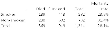
Table 1: Mortality rates for smokers and non-smokers
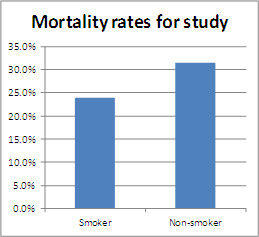
Figure 1: Overall Mortality Rates
This analysis suggests that non-smokers actually have higher mortality rates than smokers, certainly a surprising result and contrary to current medical teachings, and maybe a potential boon to the tobacco industry. But the numbers tell a much different story when mortality is examined by age group:
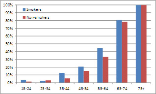
Figure 2: Mortality Rates by Age
Now, we see that smokers have higher mortality rates for virtually every age group. What is going on here? This is a classic example of the Simpson’s Paradox phenomenon; it shows that a trend present within multiple groups can reverse when the groups are combined. The phenomenon is well known to statisticians, but counter-intuitive to many analysts. To paraphrase Nassim Taleb, not only are people regularly “fooled by randomness”; they are also fooled by lurking multivariate relationships. Let us delve a little deeper into the phenomenon.
Dissolving the Paradox
Simpson’s Paradox requires several things to occur. First, the variable being reviewed is influenced by a “lurking” variable. In our example, age is the lurking variable, with the population grouped into a discrete number of subcategories. Second, the subgroups have differing sizes. If both of these conditions are met, they conspire to obscure the salient relationships in the data due to the relative weighting attached to each subgroup.
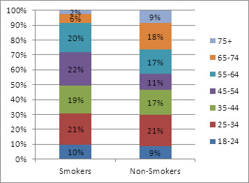
Figure 3: Distribution of Age by Smoking Status
The age distributions are substantially different for smokers and non-smokers. In particular, the non-smoking population is older on average. Twenty seven percent of non-smokers are in the two oldest groups, compared to approximately eight percent for smokers. Combined mortality rates are near 100% for both groups, but the greater proportion of older non-smokers pushes up the average for that group. Viewing the data by age leads to a more plausible theory – one that comports with long standing medical teaching: that long-term smoking shortened lifespans, thereby affecting the age distributions in the study’s population.
Case Study 2: What you see is not always what you get
The past several years have seen pricing practice undergo a significant shift in philosophy. Companies have long set prices using a “cost plus” model, whereby aggregate product costs are marked up by a desired margin to determine price. Today, companies are increasingly adopting a more consumer-centric pricing approach. Such an approach emphasizes not only the cost of production but also what the customer is willing to pay based on a variety of known and sometimes unknown factors. At the heart of consumer-centric pricing is pricing analytics: the use of data exploration and statistical analysis to gain valuable business insights unlikely to be detected by unaided judgment. Analytics has become increasingly ubiquitous in pricing—and beyond—thanks to a happy confluence of developments mentioned earlier: the increasing availability of inexpensive computing power, massive amounts of data, and sophisticated analytical tools and techniques. Also a factor is that consumers increasingly are seeking more individualized offers for products and services.
The key to data-driven pricing strategies is the relationship between the price of a product and the amount that is sold at that price. Economists refer to this relationship as the price elasticity of demand (or simply price elasticity), but it is more commonly known as price sensitivity. In the figure below, each dot represents the sales for a certain product during a given week. The x-axis represents the price, the y-axis the quantity sold. (Logarithmic values are used because we wish to analyze changes in percentages rather than in absolute dollar or purchased amounts.) The blue line represents a fitted regression model, the slope of which can be interpreted as the price elasticity. Economic theory and common sense lead us to expect the regression line to be downward sloping, meaning that as the price increases, the quantity sold should decrease. This is the expected behavior for pretty much any product or service one can think of and has been the basis of economic theory. Yet oddly enough, the line slopes upward. The seeming implication that the product analyzed sells more when its price increases flies in the face of both common sense as well as business experience with this product. What is happening here?
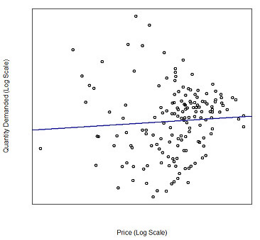
Figure 4: Price and Quantity Relationship
A different view of the data, displayed in the next figure, yields a useful insight. Here, the red line represents the average price and the blue line represents the corresponding quantity sold at each point in time. The price and quantity lines move in an inverse relationship, as we expect; in fact, the implied elasticity here is actually quite large, negatively large it is! What is causing the apparent disconnect between the two charts? Which analyses reflect the true causal relationship between the price and sales of this product?
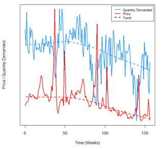
Figure 5: Price and Quantity Over Time
In addition, notice that there is an overall downward trend in price. This suggests that it might be useful to break apart and analyze the data separately by time period (see next figure in the bottom). Doing so reveals a surprising result: despite the fact that the there is a positive relationship between price and quantity in the aggregated dataset, the relationship is the expected negative one within each time period. This is responsible for the apparent paradox: the relationship between price and quantity sold is intuitively a negative one within any given time period, but reverses when the data is aggregated.
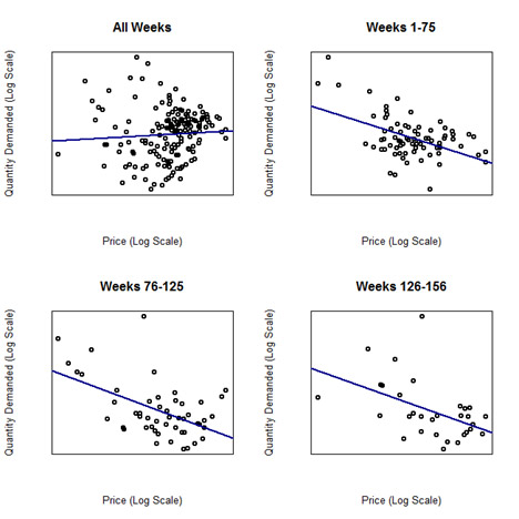
Figure 6: Price and Quantity Plotted By Periods of Time
This is another example of the Simpson’s Paradox phenomenon; in this case, the effect manifests itself on a correlation instead of a simple average.
In Figure 5, one can see that price levels and sales oscillate up and down throughout the year, except for large spikes that occur where prices decline and sales increase. Changes in price are driven by discounting or promotional activity at the store. These promotional periods vary in intensity, with two large promotions in weeks 40 and 80, and smaller promotions throughout the time period. Even without consideration of the spikes, the quantity sold has been decreasing over time; therefore, total sales vary by time period. We split the data into three groups, to capture what appear to be three distinct promotional periods: weeks 1 to 76, weeks 77 to 126 and weeks 127 to 156. These rough time periods were chosen based on the overall trend in the quantity demanded. For the first 76 weeks, sales did not have a significant downward trend, which accelerated for about one year then flattened out for the final period of little more than a year.
The fitted regressions on all of the subgroups in Figure 6 support the patterns seen in Figure 5—the elasticities now match our intuition and conventional economic wisdom. Within each time period, a negative slope is evident, while the overall slope for the entire time period is positive. This manifestation of Simpson’s Paradox is more complex than a simple average, yet still confounds our rudimentary analysis. The table below summarizes some statistics from the simple regression. Note that each individual time period has a negative slope between -2.7 and -3.4 with R2 statistics much higher than the all week grouping in each case. However, the overall slope is positive, with test statistics (not provided) indicating that the true elasticity is not different from 0. This overall statistic, however, is extremely misleading, due to the complication of time, manifesting through Simpson’s Paradox to confound our analysis.
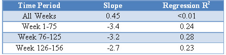
Table 2: Regression Statistics for Individual Time Periods
Case Study 3: Did price optimization increase or decrease profits?
Our final case study comes from a price optimization program implemented at a major manufacturer of cosmetic products. The manufacturer had three different store brands, which in this example will be called A, B, and C. Although the product offering was similar across all stores, each store brand had a different consumer base and prices were optimized independently for each brand. The objective of calculating optimal prices was twofold: to improve profit margins for the business as a whole without negatively impacting aggregate profit, i.e., the three store brands together; and for each store brand separately.
After the optimization models were developed and implemented, we assisted the manufacturer in a series of live controlled experiments to quantify the potential benefit coming from optimized prices and assessed whether the financial objectives were being met. In order to analyze the results, we compared the profit margins before the test (control period) and during the test period – a straightforward method to quantify benefit. We found, however, that the average margin for the whole business before the test was 7.7% and during the test was 7.4%, implying that the program was unsuccessful in improving margin. Aside from any measure of statistical significance, the absolute improvement did not justify the costs to make the program changes. Is this enough to say that the optimization program was a failure?
On the surface, the answer would seem to be “yes”: optimization apparently led to the unsatisfactory result of reduced margins. Nevertheless, when results were broken down by store brand, the story changed; and indeed the program showed significant profit margin increases across all three brands.
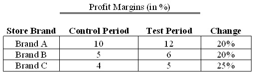

How could it be that all three brands showed margin improvement and yet the total average margin had deteriorated?
In fact, both answers are correct. Profit margins improved in each brand and yet the weighted average of the margins dropped in total. The answer is hidden in Simpson’s Paradox and its arithmetic illusion in which clear patterns are obscured when the mix of the groups being weighted averaged changes over time. Responsible for the strange and apparently contradictory results is the fact that the mix of store brands changed pre- and post-test. During the test period, the manufacturer underwent a major change in its branding strategy and had shifted the mix of store brands significantly.
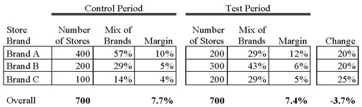

As can be seen from the table above, although the total number of stores remained constant, the concentration of store brands B and C increased. Moreover, store brands B and C have lower margins than store brand A. The store mix shift to lower-margin brands created a Simpson’s Paradox effect. It is important to point out that the optimization program was successful and did increase margins and dollars for the manufacturer. The percentage margin reduction for the whole business resulted not from problems with the price optimization strategy, but from the manufacturer’s store brand strategy. Had the optimization results not been thoroughly understood and analyzed with an awareness of Simpson’s Paradox, one could have easily come to the wrong business conclusion.
Detection and Remediation
Once Simpson’s Paradox is understood, there are several simple ways to avoid it. The first is by improved diagnostics. Additional queries, in which two-way cross-frequencies are generated, could indicate where there are distributional differences that might lead to skewed results. In addition, a simple correlation analysis may indicate variables with strong interrelationships that need to be considered in the modeling. In most software packages it is possible to write standard programs or run reports that can produce diagnostics for all variables, or all combinations of two variables, which can identify potential issues with little repetitive work.
A demonstrated way to counter Simpson’s Paradox, though, is by a thorough understanding of the business and problem being studied. Knowledge of historical events can lead to the definition of appropriate subgroups or to new variables that isolate those events. Such information could be relevant to a company, as in the example above, which was based on company sales and promotions. Alternatively, industry-wide trends and characteristics may be just as important.
One example of an industry-wide characteristic is for companies selling high-technology products. Products are constantly facing obsolescence, and being replaced by other products. Often, items are discounted deeply once newer items are introduced to the market. Here, the effect of newer technology is as strong as, or stronger than, the innate price elasticity of the original product. To perform a proper pricing analysis, the effect of emerging technology needs to be controlled for explicitly.
Conclusion
As data and computational power continue to grow exponentially, analysts have gained unprecedented power to build and promulgate data-driven decision models, shifting business practice away from traditional decision making practices rooted in industry knowledge and intuition. However to paraphrase Voltaire (or Uncle Ben from Spiderman), with great power comes great responsibility. It is obvious that poorly or naively performed statistical analyses can yield incomplete or ambiguous answers. Phenomena such as Simpson’s Paradox illustrate the stronger point that unless used with sufficient insight and domain knowledge, even simple statistical analyses can downright mislead and motivate misguided decisions. This should be borne in mind in situations where sophisticated analytical workbenches are adopted by users who do not possess commensurate statistical understanding.
Simpson’s Paradox can be avoided through a combination of critical thinking and improved analytics, including reviews of frequency tables and correlations. Crucial to the process is a strong understanding of the drivers and limitations of the data. Awareness of company, market, consumer and other general trends can enable the analyst to quickly focus in on and test relevant variables during the data-mining process. As practitioners and business leaders leveraging the evolving power of analytics, it is our responsibility to foster and support the proper use of statistics to improve decision making, ultimately improving business and public outcomes.


